Plotting results from SQLite files
A standard plotting routine is provided to generate figures from data generated by gfdlvitals that is stored in the SQLite data files.
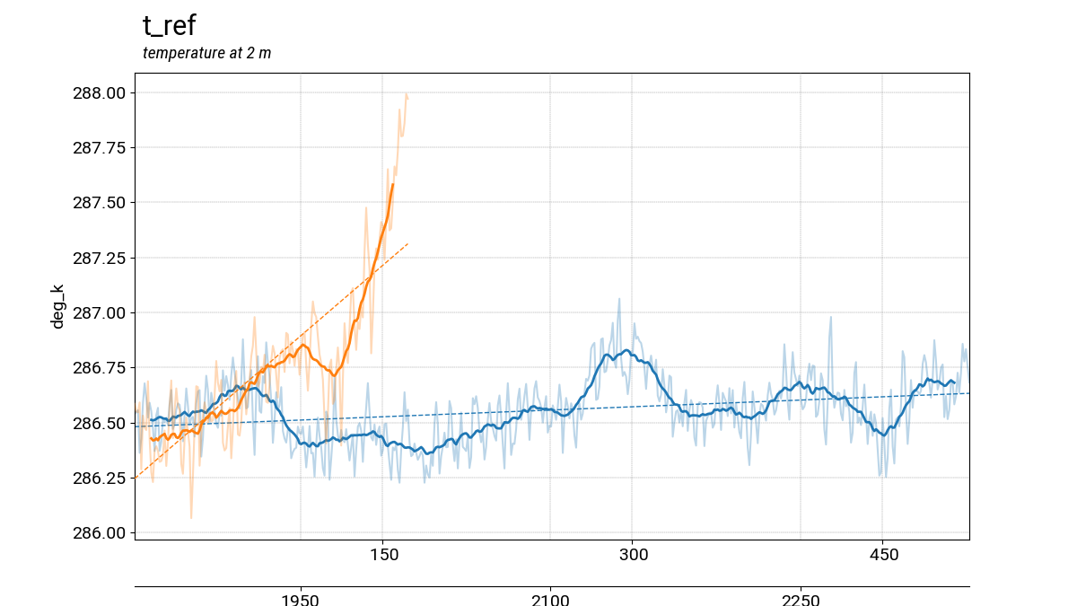
Making plots within a Jupyter notebook
The code below illustrates how to use the plotting function on the
sample data provided with the gfdlvitals package. The plotting
function can take multiple gfdlvitals.VitalsDataFrame objects
if they are passed into the function as a list. There are additional
options to smooth the data, overlay a trend line, and align offset
time axes.
In [1]: import gfdlvitals

In [2]: df_ctrl = gfdlvitals.open_db(gfdlvitals.sample.picontrol);

In [3]: df_hist = gfdlvitals.open_db(gfdlvitals.sample.historical);

In [4]: fig = gfdlvitals.plot_timeseries([df_ctrl,df_hist],\
   ...:     align_times=True,\
   ...:     trend=True,\
   ...:     smooth=20,\
   ...:     var="t_ref",\
   ...:     labels="Preindustrial Control,Historical");
   ...:
Using the command-line interface
The same plotting function can be called from the command line and an X-window Matplotlib figure viewer will appear with the plot. The inputs to the script are the SQLite (*.db) files and the various options can specified with flags.
plotdb [-h] [-a] [-t] [-s SMOOTH] [-l LABELS] [-n NYEARS] DB FILES [DB FILES ...]
DB FILES: Path to input database files
-a, align: Align different time axes
-t, trend: Add trend lines to plots
-s, smooth: Apply a n-years smoother to all plots
-l, labels: Comma-separated list of dataset labels
-n, nyears: Limit the plotting to a set number of n years
Hint
Use the left and right arrows keys on the keyboard to cycle through different variables