Using the VitalsDataFrame Class in Jupyter
The VitalsDataFrame class provides a direct interface between
the SQLite files generated by the gfdlvitals package and Python.
The class is an extension of a Pandas DataFrame with additonal methods
for smoothing and detrending.
The following imports are needed to start:
In [1]: import gfdlvitals

In [2]: import matplotlib.pyplot as plt

In [3]: from matplotlib.figure import figaspect
Loading SQLite datasets
The package ships with two demonstration datasets of 2 meter near surface air temperature from a preindustrial control simulation and a historical similation. Any path-like string pointing to a SQLite file can be passed to open_db:
# Load demonstration datasets
In [4]: df_ctrl = gfdlvitals.open_db(gfdlvitals.sample.picontrol)

In [5]: df_hist = gfdlvitals.open_db(gfdlvitals.sample.historical)
The details of a dataset are display by calling the object directly:
In [6]: df_hist
Out[6]:
                             area       t_ref
1850-07-01 12:00:00  5.100640e+14  286.584833
1851-07-01 12:00:00  5.100640e+14  286.550367
1852-07-01 12:00:00  5.100640e+14  286.545789
1853-07-01 12:00:00  5.100640e+14  286.591339
1854-07-01 12:00:00  5.100640e+14  286.287207
...                           ...         ...
2010-07-01 12:00:00  5.100640e+14  287.799508
2011-07-01 12:00:00  5.100640e+14  287.801954
2012-07-01 12:00:00  5.100640e+14  287.859331
2013-07-01 12:00:00  5.100640e+14  287.992293
2014-07-01 12:00:00  5.100640e+14  287.970241

[165 rows x 2 columns]
In this DataFrame we see that the index is the time coordinate using
the cf-time package. The global area and t_ref fields are also shown.
Plotting a field
Like a Pandas object, the .plot() is available for plotting a
variable directly:
In [7]: plotargs = {"color":"gray",
...: "linewidth":"0.8",
...: "ylabel":"DegK"};
...:
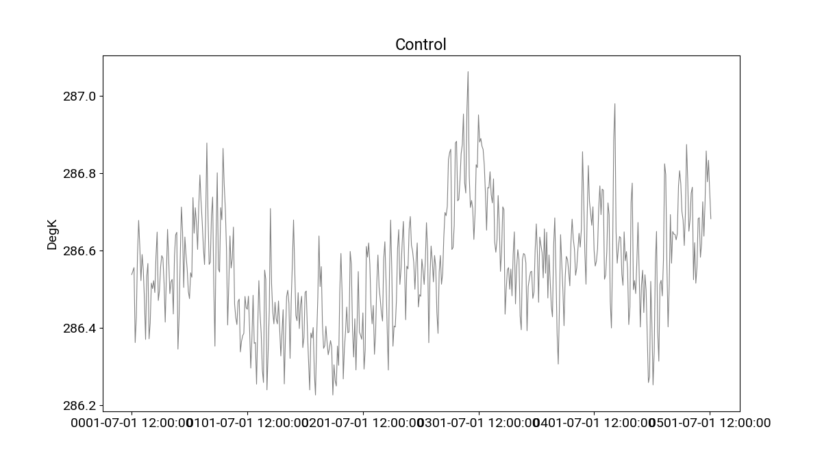
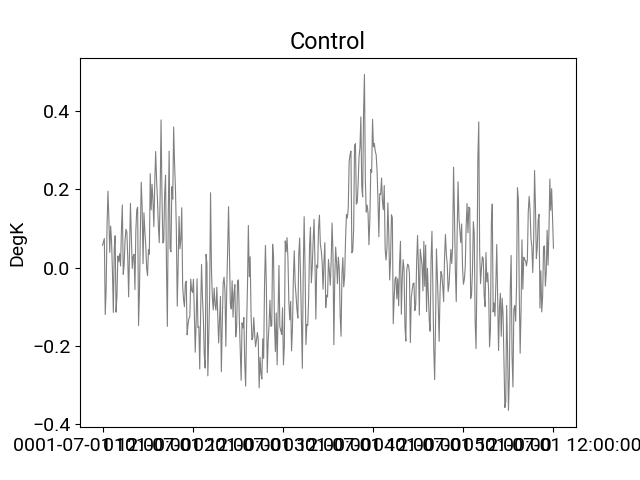
In [8]: df_ctrl.t_ref.plot(title="Control",**plotargs);
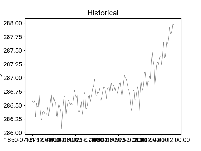
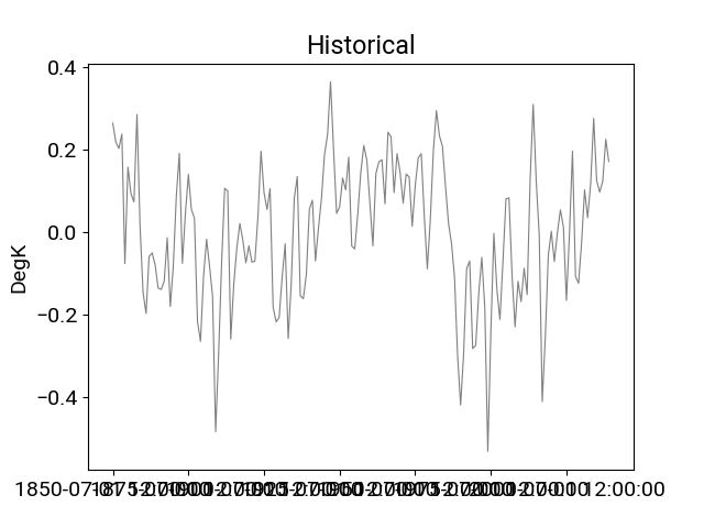
In [9]: df_hist.t_ref.plot(title="Historical",**plotargs);
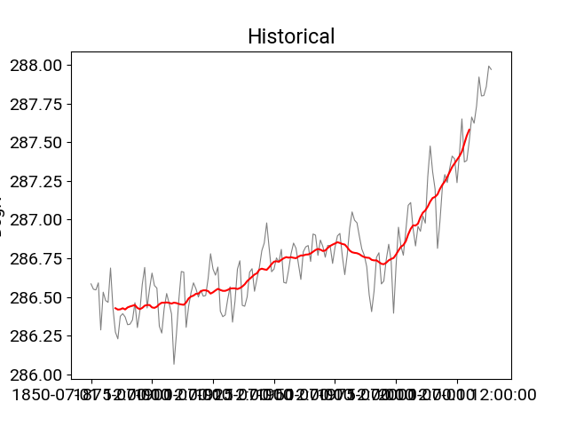
Smoothing the timeseries
In [10]: df_hist.t_ref.plot(title="Historical",**plotargs);

In [11]: df_hist.smooth(20).t_ref.plot(color="red");
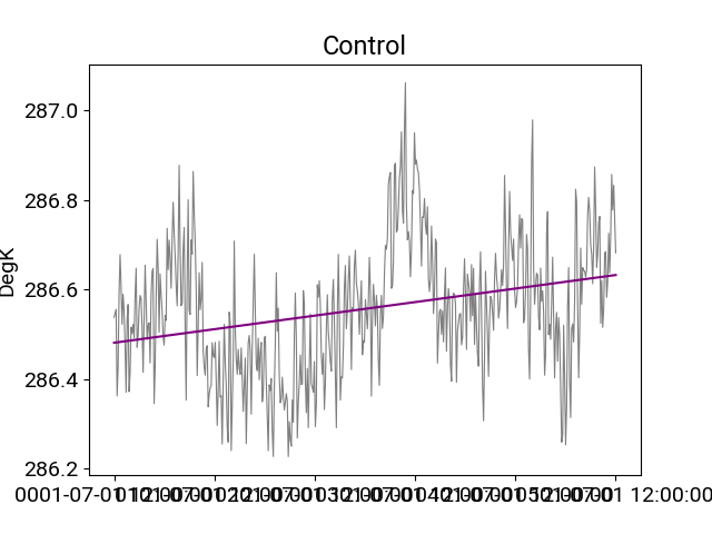
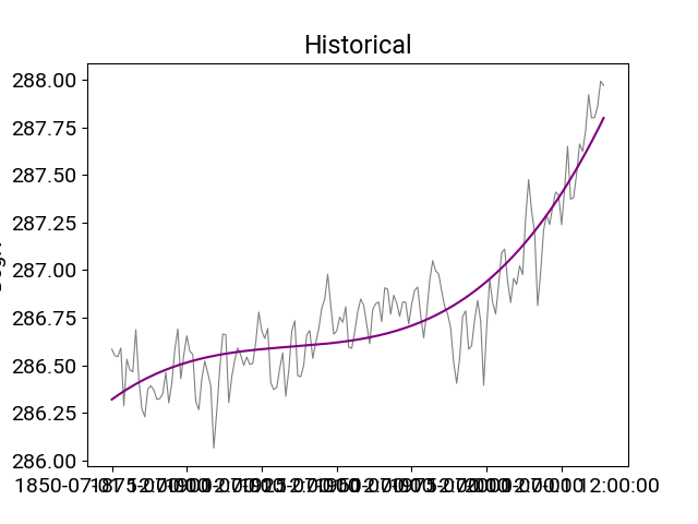
Identifying trends
In [12]: plotargs = {"color":"gray",
   ....:             "linewidth":"0.8",
   ....:             "ylabel":"DegK"};
   ....:

In [13]: df_ctrl.t_ref.plot(title="Control",**plotargs);

In [14]: df_ctrl.trend(order=1).t_ref.plot(color="purple");

In [15]: df_hist.t_ref.plot(title="Historical",**plotargs);

In [16]: df_hist.trend(order=3).t_ref.plot(color="purple");
Detrending
In [17]: plotargs = {"color":"gray",
   ....:             "linewidth":"0.8",
   ....:             "ylabel":"DegK"};
   ....:

In [18]: df_ctrl.detrend(order=1).t_ref.plot(title="Control",**plotargs);

In [19]: df_hist.detrend(order=3).t_ref.plot(title="Historical",**plotargs);
Removing drift
In [20]: df_hist_detrended = df_hist.detrend(order=1,
....: reference=df_ctrl,
....: anomaly=False);
....:
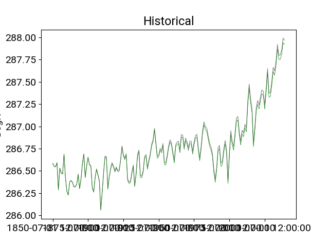
In [21]: df_hist.t_ref.plot(title="Historical",**plotargs);
In [22]: df_hist_detrended.t_ref.plot(color="green",linewidth=0.5);
Statistical comparison of two datasets
An instance of the VitalsDataFrame can be passed to a second instance and a t-test can be performed to identify differences between variables that are common to the two instances. The t-test adjusts the degrees of freedom based on the autocorrelation of the timeseries providing a more stringent threshold for assessing differences. For more details and examples of this method, see Santer et al. 2000 and Krasting et al. 2013.
In the example below, the test historical dataset is artifically split into two 20-year epochs for comparison.
In [23]: df_hist_t0 = df_hist[-40:-20]

In [24]: df_hist_t1 = df_hist[-20::]

In [25]: pvals = df_hist_t0.ttest(df_hist_t1)

In [26]: pvals
Out[26]:
           pval
t_ref  0.010851